The first week of the 3D course is finished, and we have been going through different elements of art and how they are used in 3D environments.
We also did an analysis on different screenshots from various games to find how they’ve used the elements of art: Lines, Shapes, Space, Values, Colors and Texture.
1: BATMAN
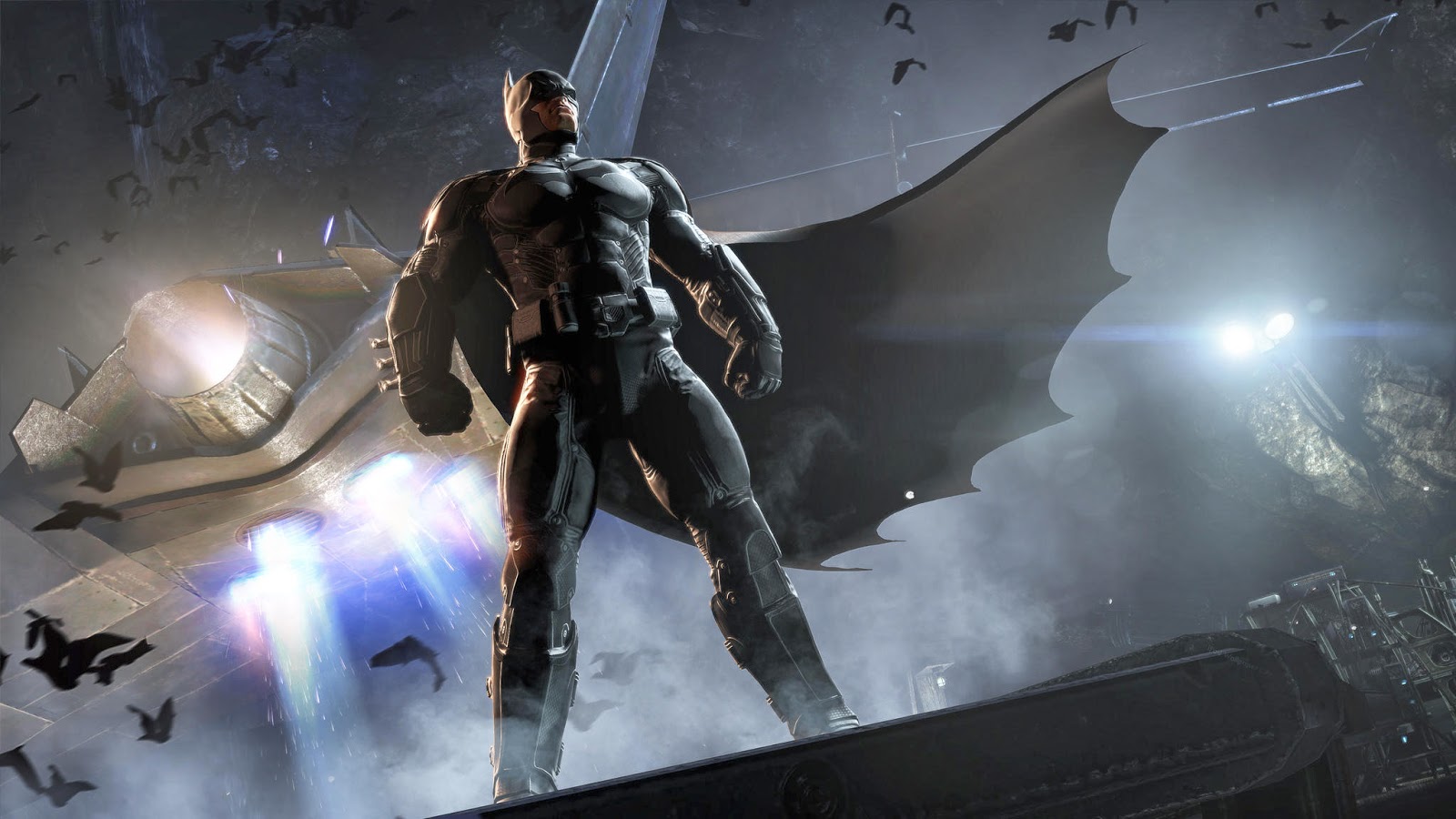
In this picture of Dc’s character Batman. We can see that it is meant to be very dramatic, having the camera look up towards Batman standing on a ledge. This gives the feeling of him being powerful and serious. The lines in this picture are vertical as well as diagonal, with batman standing tall and the camera tilting a bit to give the picture a sense of action and movement, in this case the batplane in flight and the cape blowing in the wind.
Batman takes up most of the space in the picture meaning that the focus is supposed to be on him. They also have other elements in there to set the tone of the picture, for instance the bats flying around the plane, creating a sort of frame around batman, once again enhancing the focus on him.
The values of this picture stand out very much, with Batman, having a almost completely black suit, paired up with the blinding lights of the spotlights in the background and the batplanes bright flames. Having these extreme contrasts make Batman almost pop out of the picture since he is the darkest thing on set.
The different textures that can be seen in the picture are Batman’s leathery suit. the rock surfaces in the background, and the ship made out of worn out metal. All of these which can be recognized by how they reflect light, leather has a matte or non shiny reflection, while the ship has a more shiny, yet brittle reflection.
The shapes on Batman are very pointy and sharp, giving the impression “stay away” when seeing him since sharp and pointy often means dangerous.
For the sake of not exceeding the allowed word count, I’m going to streamline the rest of this analysis.

Picture 2: Battlefield hardline
Lines: A lot of diagonal lines in this picture, and along with the tilted camera, it makes the scene look action-filled and fast.
Shapes: Most of the shapes are solid and sharp edged meaning the houses , the helicopter and all the objects on the roof. While the people and the clouds in the sky are more organic and alive looking, making them stand out in the picture.
Space: The people sliding on the zip-line and the building they are approaching as well as the helicopter are the positive space in this picture, while the sky and background buildings are negative space.
Values: The foreground on this picture has a darker value in comparison to the background.
Colours: This is a pretty cold picture over all, with a blue tint from the sky and the brown and monochrome buildings. This makes the red bag of the person in front look more important and makes it stand out more.
Texture: The textures of this picture consists mostly of hard objects, concrete and glass that reflects plenty of light. Then we have the characters that are very organic.

Picture 3: Mirror’s edge
Lines: The picture mostly consists of vertical lines, giving the picture a sense of height. And the slightly tilted camera makes it look like something is going to happen.
Shapes: all the shapes except for the character, clouds and mountains have a very hard looking shape with box like buildings all around which makes it all feel and look man-made, the character and remaining objects look natural.
Space: The character and the building she’s scaling and the building behind her makes up for the positive space, while the rest is negative.
Values: The picture is very high key overall, with the exception of the character having some black clothing.
Colours: The colours of the picture are mostly black and white, giving a futuristic and clean look. Having this also makes other, stronger colours stand out, the characters shoes and details being one example.
Texture: Most objects in the picture all have a very reflective glass looking texture, while the character has more cloth and a leather looking vest.

Lines: This picture has a horizontal line, making the picture look slow and giving the impression of slow motion, the moment before the action starts, which in turn makes things more dramatic in a way.
Shapes: The shapes are very organic in the picture, except for the sword the character is holding. Having a difference in size of the two characters in the picture adds tension to the whole scene, making it feel a bit like a David vs Goliath fight.
Space: The character and creature take up the positive space, while the rest serves as negative space.
Values: There is a very big contrast between the middle light and the ground in this picture, the light in the middle is very bright, almost blindingly so, while the ground and the top clouds are much darker and creates a very nice frame like effect.
Colours: There are not a lot of colour in this picture except on the characters, since they are the focus. This makes them more visually interesting.
Texture: The characters have different kinds of textures each. The human having organic shapes and textures, while the rock monster has more rock and nature based textures.
3D assignment.


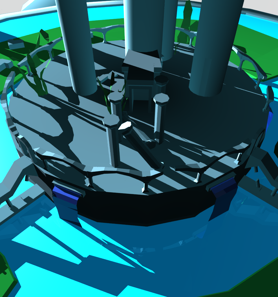
For this assignment we got to pick between different themes and a example game for our level. We picked an uncharted inspired level with the keywords ‘magic’ and ‘solitude’. we went for an abandoned Atlantis-esque city, capsuled inside a dome. with broken pillars and structures with no life in sight. When we took the screenshots we wanted to capture the feeling of something grand that was lost with time, and hopefully we managed to convey that feeling.
That’s all i have for this week, see you all next time! 😀
